

By Ava Markoutsas
ABLAZE Design Group
One minute, your kitchen island is covered with sippy cups and coloring books. The next, it is homework headquarters, a snack bar for a house full of teenagers and the place where everyone gathers during the holidays.
Family life changes quickly. Our homes should be able to keep up.
At ABLAZE Design Group, we believe the best homes are not designed for one perfect stage of life. They are designed to grow with the people living in them. That means creating spaces that work for today’s routines while also anticipating what your family may need five, ten or even twenty years from now.
We often say, “Form Follows Function First.” In other words, a home can be beautiful, but if it makes everyday life harder, it is not truly well designed.
Before we begin drawing plans or selecting materials, we want to understand how a family actually lives. Where do the backpacks land after school? Does everyone crowd around one small section of the kitchen each morning? Can you prepare dinner while helping with homework? Is there a comfortable place for grandparents to sit and be part of the activity? Where does clutter seem to multiply overnight?
These everyday details shape better design.
Our approach centers on family, flow and function. When those three things are aligned, the home feels easier to live in. Rooms connect more naturally, storage is located where it is actually needed and daily routines require less effort.
Universal Design plays an important role in that process. While the term is often associated with aging in place, it is really about creating homes that are comfortable, intuitive and usable for people of all ages and abilities. Our design team is certified in Universal Design, allowing us to thoughtfully incorporate these principles without making a home feel clinical or compromising its style.
A wider walkway is helpful for a grandparent using a walker, but it is equally helpful for a parent carrying a baby, a toddler racing through the kitchen or two people trying to unload groceries at the same time. Easy-to-reach drawers work for children, adults and anyone who would rather not crawl into the back of a cabinet searching for a mixing bowl.
Good Universal Design should not announce itself. It should simply make life feel easier.
In a kitchen, that may mean incorporating drawers instead of hard-to-reach lower cabinets, creating multiple work zones or providing seating at different heights. A large island can become a place for cooking, homework, entertaining and family conversations. Durable surfaces can handle spills and everyday wear while still looking refined.
Elsewhere in the home, a playroom may eventually become a study space, home office or teen lounge. A first-floor den could later serve as a guest room. A luxurious curbless shower can feel spa-like today while also providing greater comfort and accessibility in the future.
Wellness matters, too. A thoughtfully designed home can support both physical and emotional well-being. Natural light, comfortable circulation, quieter materials, layered lighting and less visual clutter can help a space feel calmer. When everything has a place and the floor plan supports your routine, the home asks less of you.
And honestly, most families could use a home that asks a little less of them.
A home that grows with you is not about trying to predict every future possibility. It is about making thoughtful choices now that provide flexibility later. It should welcome new babies, growing children, visiting grandparents, changing routines and all the beautiful chaos in between.
Because the most successful homes are not simply designed to be admired. They are designed to be lived in.
Highwood, IL — ABLAZE Design Group is proud to announce that its Lake Forest Showhouse Kitchen has been longlisted for the 2026 Créateurs Design Awards (CDA), an international design competition recognizing excellence, innovation, and cultural impact across architecture and interior design.
Selected from an exceptional global pool of submissions, the Lake Forest Showhouse Kitchen stood out for its thoughtful space planning, refined materiality, and lifestyle-driven approach to modern living. The project reflects ABLAZE Design Group’s continued commitment to creating spaces that balance beauty, performance, and wellness — while honoring the architectural integrity of historic homes.
Designed by George Markoutsas, CEO and Creative Director of ABLAZE Design Group, the kitchen was featured as part of the prestigious Lake Forest Showhouse & Gardens. The space reimagines the kitchen as the heart of the home, blending elevated craftsmanship, natural textures, and intuitive functionality to support both everyday living and gracious entertaining.
“Being recognized by an international design community like Créateurs is incredibly meaningful,” said Markoutsas. “This project represents what we believe design should do today; enhance how people live, connect, and feel in their homes.”
The Créateurs Design Awards celebrate creative leaders whose work resonates globally and pushes the industry forward. Projects selected for the longlist now advance to the final round of voting, with official nominees to be announced on January 5, 2026.
ABLAZE Design Group has a long-standing presence at the Lake Forest Showhouse and continues to be recognized for its award-winning, wellness-driven design-build work throughout Chicago’s North Shore and beyond.
Residential Kitchen Over $200,000
Highwood, Illinois (February, 3rd 2026) ABLAZE Design Group has been named a 2026 Regional Remodeler of the Year (RotY®) Award Winner by the National Association of the Remodeling Industry (NARI) in the category of Residential Kitchen Over $200,000.
The prestigious RotY® Awards recognize excellence in craftsmanship, design, innovation, and project execution across the remodeling industry. ABLAZE’s winning project was selected from hundreds of entries nationwide and represents the highest level of achievement among regional remodeling professionals.
“This award is a true reflection of our team’s dedication to thoughtful design, meticulous execution, and creating kitchens that elevate how our clients live every day,” said George Markoutsas, CEO and Creative Director of ABLAZE Design Group. “To be recognized by NARI at this level is incredibly meaningful, especially for a project that so fully embodies our belief in wellness-driven, highly functional, and beautifully crafted spaces.”
Each year, NARI’s RotY® Awards honor remodelers who demonstrate outstanding work through completed projects that are judged by industry experts on criteria including problem-solving, innovation, craftsmanship, and overall presentation. This year’s entries represented nearly $138 million in remodeling projects, with 159 regional winners recognized nationwide.
ABLAZE’s award-winning kitchen exemplifies the firm’s signature approach, balancing elevated aesthetics with performance, longevity, and everyday livability. The project reflects ABLAZE’s commitment to “quiet luxury,” purposeful material selection, and designs that seamlessly integrate form, function, and lifestyle.
Regional winners will be honored alongside national winners at NARI’s Evening of Excellence on April 23, 2026, held during the NARI Annual Conference in Tempe, Arizona.
About ABLAZE Design Group
Based in Highwood, Illinois, ABLAZE Design Group is an award-winning, full-service design-build firm specializing in luxury kitchens, baths, and whole-home renovations throughout Chicago’s North Shore and beyond. Known for its wellness-driven, biophilic, and highly customized design solutions, ABLAZE delivers thoughtful spaces rooted in craftsmanship, innovation, and enduring quality.
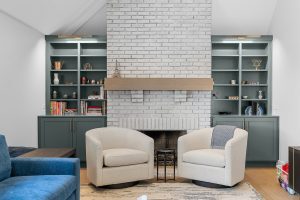 Picking paint should feel simple, but it rarely is. A color that looks warm and creamy in the store can turn weirdly pink at home. A “clean white” can suddenly read blue or green. That’s not you being picky—that’s paint undertones showing up under your specific lighting, flooring, and finishes. The goal isn’t to find a “perfect” paint chip. It’s to choose a color that behaves well in your space from morning to night.
Why Wall Paint Undertones Change From Store to Home
Paint isn’t just a color—it’s a mix of pigments that react to light. Showrooms and paint aisles often use bright, cool lighting that flattens the way a color reads. Your home has different variables: natural light direction, window tint, tree shade, warm bulbs, cool bulbs, and reflective surfaces. Those variables pull paint undertones forward, which is why a neutral can suddenly look lavender or slightly green once it’s on the wall.
Paint Undertones and Your Fixed Finishes
The easiest way to avoid regret is to compare paint to what you’re not changing. Flooring, countertops, cabinets, tile, stone, and even large rugs influence how paint reads. If your floors pull warm (golden oak, warm tile, creamy travertine), a cool gray can look icy. If your counters have a green-gray vein, a “neutral” beige can look pink next to it. Paint undertones don’t exist in isolation—they interact with everything around them.
Sample Smarter, Not Harder
A tiny paint chip isn’t enough. Instead, test large samples in multiple spots. Paint a few poster boards (or use peel-and-stick samples) and move them around: near windows, in darker corners, and next to trim. Look at them in morning light, midday light, and at night with lamps on. This is the fastest way to see what paint undertones are doing in real conditions, without committing an entire room.
Don’t Ignore Sheen and Trim Color
Sheen changes perception. Matte tends to absorb light and can make colors feel softer, while eggshell or satin reflects more and can make undertones more noticeable. Trim color matters too. Bright white trim can make a wall color look darker or cooler; warmer trim can make a neutral wall color look more yellow. If you’re repainting trim, decide that first—because paint undertones can shift when the surrounding white changes.
A Clean Process That Prevents “Almost Right”
Most paint regret happens when a color is close—but not quite. The fix is rarely repainting immediately; people live with it, and the room never feels finished. A professional approach treats paint selection like design, not guessing. When you plan for lighting, finishes, sheen, and trim together, paint undertones stop being a surprise and start becoming a tool you can use intentionally.
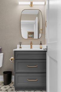 It’s easy to fall in love with a finish in a showroom. It’s harder to love that same finish three years later after fingerprints, cleaning, sunlight, kids, pets, and everyday wear have had their way with it. A beautifully designed home isn’t just about how it looks on day one—it’s about how it holds up. Choosing finishes that age well means selecting materials and surfaces that stay attractive, feel comfortable to live with, and don’t require constant maintenance to look “nice.”
What “Finishes That Age Well” Really Means
A finish that ages well does two things: it wears gracefully and it cleans easily. It doesn’t show every smudge, scratch, or water spot. It holds up to routine use without looking tired. The goal isn’t perfection—it’s durability with a lived-in softness. Finishes that age well tend to have depth, texture, or subtle variation that hides the little marks that show up in real life.
Go For Texture Over Gloss Finishes
High-gloss looks striking, but it often highlights imperfections. It can show fingerprints, streaks, and tiny scratches more than most homeowners expect. Softer sheens and tactile textures usually feel more forgiving. Matte and satin finishes often look more consistent over time, especially in busy spaces. When you’re choosing finishes that age well, think “forgiving” and “cleanable,” not “flawless.”
Choose Materials That Hide Wear
Natural variation is a secret weapon. Stone with movement, wood grain, lightly patterned tile, and surfaces with subtle mottling help disguise daily wear. Solid, perfectly uniform surfaces can look stunning—but they can also show every mark. A finish with visual depth helps a home stay looking polished without constant upkeep, which is a big reason finishes that age well tend to have a little dimension to them.
Consider How You’ll Clean It
Some finishes are technically durable but miserable to maintain. If a surface requires specialty cleaners, frequent sealing, or constant polishing to look good, it may not feel “worth it” in daily life. A better approach is selecting finishes that tolerate normal cleaning habits. Finishes that age well work with your routine, not against it.
Think About Sunlight and Time
Natural light is beautiful, but it changes materials. Some woods deepen or shift over time. Some fabrics fade. Some paint colors look different as lighting changes seasonally. A good designer plans for how the home will look in bright afternoon sun and soft evening light—and how it will look after years of exposure. Choosing finishes that age well includes considering time as part of the design.
Choosing Finishes – The Most Timeless Option Is the One You Don’t Have to Babysit
The best homes feel relaxed, not fragile. When finishes are chosen with durability and real life in mind, the home stays inviting and cohesive—without feeling like you have to protect it from your own family. Finishes that age well are the ones that make the space easier to live in, not harder.
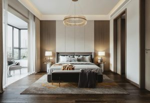 A primary bedroom has one job: help you unwind. Yet many bedrooms feel more like a catch-all space than a retreat. Clothes drape over chairs, lighting feels harsh, and the layout competes with relaxation instead of supporting it. Thoughtful primary bedroom design can shift the space from chaotic to calming without relying on major renovations. It’s about focusing on the sensory details that shape how your mind and body feel the moment you walk in.
Primary Bedroom Design That Creates the Relaxing Retreat You Want & Need
Start With Lighting That Supports Your Rhythm
Lighting dictates mood more than almost any other design element. Bedrooms benefit from layered lighting—ambient, task, and accent—so the room can shift effortlessly from morning brightness to evening calm. Warm-temperature bulbs (2700K–3000K) soften the entire space, especially when paired with dimmers. Sconces or pendant lights beside the bed free up nightstand space and eliminate the glare that overhead fixtures create. If you want the room to instantly feel more peaceful, adjusting lighting is one of the quickest wins.
Choose Colors for Your Primary Bedroom That Quiet the Nervous System
Color psychology matters most in the room where you begin and end each day. Soft neutrals, muted greens, warm grays, and dusty blues tend to anchor the space without feeling heavy. These tones support natural relaxation because they mimic colors in nature and reduce visual noise. In primary bedroom design, contrast is still important—too much neutrality can feel flat—so adding depth through textured bedding, natural woods, or toned-down accent colors gives the room dimension while keeping the palette restful.
Your Primary Bedroom Layout Should Encourage Flow and Ease
Many bedrooms feel cramped not because they’re small, but because the layout forces awkward movement. Make sure there’s a clear pathway from the door to the bed and that furniture doesn’t jut into natural traffic lines. Positioning the bed so it’s visible when you enter creates a sense of grounding. Incorporating closed storage—dresser drawers, baskets, nightstands with doors—helps eliminate visual clutter, which makes the entire room feel calmer even when life gets busy.
Add Sensory Details That Signal Relaxation
The most relaxing bedrooms engage the senses lightly, without overstimulation. Soft rugs, breathable fabrics, blackout curtains, and a thoughtfully chosen scent can all support a restful environment. Consider natural materials like linen, cotton, wool, and wood, which feel warm and inviting without adding chaos. For clients who struggle with sleep, noise-absorbing textiles or simple white-noise strategies can make a noticeable difference.
A Primary Bedroom Retreat Designed for Real Life
A well-designed primary bedroom doesn’t need to feel staged or overly curated. It should feel lived-in, supportive, and aligned with how you naturally wind down. When lighting, color, and layout work together, the space becomes more than just a room with a bed—it becomes a daily reset point that’s built to restore you.
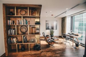 A home office should make your day feel easier, not more stressful. Yet many work-from-home setups evolve piecemeal – an extra chair here, a mismatched lamp there – until the space becomes a mix of convenience and compromise. Realistic home office design isn’t about creating a Pinterest-perfect workspace. It’s about designing an environment that supports focus, feels good on camera, and works with your actual daily routine.
Create a Background In Your Home Office Design That Looks Good Without Trying
Video calls have made the background almost as important as the workspace itself. You don’t need a full bookshelf wall or bold statement art to pull this off. What matters is intention. A clean, neutral backdrop keeps the eye relaxed and prevents visual distractions. Soft greenery, textured wall panels, or a simple framed print create interest without overwhelming the screen. The goal is to convey calm professionalism—something that blends into the conversation so the focus stays on you, not what’s behind you.
Incorporate Lighting in Your Home Office Design That Makes You Look Awake
Lighting impacts everything—from how you appear on video to how energized you feel during long stretches of work. The most effective setups pair natural daylight with adjustable artificial light. Place your desk so indirect daylight hits your face rather than your back; front-facing light keeps shadows minimal and prevents the overexposed halo effect. When daylight isn’t enough, a warm LED desk lamp or overhead fixture fills the space without harshness. In home office design, layered lighting isn’t a luxury—it’s what keeps eyestrain down and video calls clear.
Use Storage That Works the Way You Do
Clutter builds up quickly in a home office because work and life tend to overlap. Closed storage is your best friend here—drawer units, cabinets, and bins hide the mess so the space feels calm and intentional. Open shelving can still work, but keep it curated: a few books, a plant, maybe a sculptural object. The more visual noise you remove, the easier it becomes to shift into focus mode. Storage should support habits, not fight them. If you drop papers on your desk out of convenience, add a desktop organizer or a hidden inbox tray.
Set Up a Layout That Reduces Stress
A functional layout supports both the body and the mind. Make sure you have enough surface area for your daily tasks, and keep frequently used items within reach. If possible, separate work zones—one for the computer, one for writing or reading—to mimic the flow of a traditional office. This creates small mental resets throughout the day and subtly improves productivity.
Home Office Design – A Space That Supports Real Work
A well-designed home office blends clarity, comfort, and ease. When your background, lighting, and storage work together, the space becomes a place where work feels more manageable—and video calls feel a whole lot less stressful.
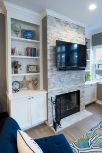 A fireplace is naturally the heart of a room—but the wall surrounding it decides whether it fades into the background or commands attention. Modern fireplace feature walls blend architectural design with everyday function, turning living rooms into cohesive, beautifully lit spaces that feel both calm and complete.
Stone Fireplace Feature Walls Add Texture and Weight
Stone brings depth, texture, and a timeless feel. From stacked limestone to smooth quartzite, stone fireplaces make an immediate statement. Lighter tones brighten modern interiors, while darker hues create grounded warmth. Continuing stone onto a low bench, hearth, or adjacent shelving ties the whole composition together without visual clutter.
Tile for Fireplace Feature Walls: Versatility and Detail
Tile brings endless variation in color, size, and finish. Large-format porcelain panels create sleek surfaces with minimal grout, while handmade ceramics or marble mosaics introduce artistry. A tiled surround can be extended vertically for dramatic height or wrapped horizontally to emphasize width—both techniques visually anchor the firebox and balance tall ceilings.
Plaster and Stucco for Fireplace Feature Walls
Smooth plaster or limewash provides a seamless look that highlights shape and proportion over pattern. This minimalist take on fireplace feature walls works well in modern and transitional homes alike. Subtle curvature, recessed niches, or a linear gas insert add sophistication. Because plaster is paintable, future refreshes are simple to achieve without needing to fully remodel the fireplace.
Integrated Storage Elevates Everyday Function
The best fireplace feature walls do more than look good—they work hard. Built-in shelving, concealed cabinets, or asymmetrical niches offer space for décor, media components, or wood storage. When paired with discreet lighting, storage becomes part of the aesthetic rather than an afterthought, keeping remotes, cables, and speakers out of sight.
Lighting for Fireplace Feature Walls: Proportion Matters
Accent lighting brings materials to life. Wall washers and recessed LEDs graze stone and tile to reveal texture, while art lights spotlight shelves without glare. Correct proportion—balancing firebox size, wall height, and mantle depth—ensures the wall feels commanding but not overwhelming. Measure twice; the relationship between opening, hearth, and ceiling line sets the tone.
Where Design Meets Comfort
A thoughtfully built feature wall transforms the fireplace from a heating element into the emotional center of the home. With the right material palette, integrated storage, and lighting plan, the result is architecture and atmosphere in a single gesture—warm, functional, and made to last.
 Lighting isn’t just about brightness—it’s about mood. The color temperature lighting you choose affects how a room looks, feels, and even how people behave in it. Warm tones invite comfort, cool tones sharpen focus, and balanced tones tie a home together. The key is knowing what belongs where and why it matters for daily living.
Warm Color Temperature Lighting Creates Comfort
Warm light (2700K–3000K) mimics the golden glow of sunset. It softens hard edges and makes colors feel richer, which is why it’s ideal for bedrooms, living rooms, and dining areas. This type of color temperature lighting encourages relaxation and conversation, setting a tone that feels calm and connected. Dim-to-warm bulbs extend the effect for evening routines.
Cool Color Temperature Lighting Enhances Focus
Cooler light (4000K–5000K) resembles daylight and energizes a space. It’s perfect for kitchens, home offices, laundry rooms, and garages where clarity matters. Under cool color temperature lighting, details stand out and surfaces look crisp—helpful when reading recipes, handling tools, or doing close work. Use it with high-CRI bulbs to maintain accurate color rendering.
Neutral Lighting Balances the Home
Between warm and cool lies neutral white (3500K–4000K), the bridge tone that keeps transitions smooth. Neutral color temperature lighting prevents jarring jumps between cozy and clinical zones and suits hallways, mudrooms, and shared spaces. It’s also a smart default for open-concept homes where multiple activities and ambiences overlap throughout the day.
Layer Light with Intentional Color Temperature Lighting
No single fixture can do it all. Layered lighting combines ambient, task, and accent sources—each with a deliberate color temperature lighting choice. In a kitchen, warm pendants create dining ambiance, cool under-cabinet strips support prep work, and neutral recessed cans provide overall visibility. In a bedroom, warm sconces and a neutral ceiling fixture keep the room versatile without glare.
Small Tweaks, Big Perception Shifts
Color temperature lighting changes how surfaces read: marble looks cleaner under neutral light; wood feels richer under warm tones; stainless steel pops under cooler light. Dimmers expand usefulness, while smart controls schedule shifts from cool morning light to warm evening tones that support wind-down.
Design That Matches Real Life
When lighting matches the function of each space, your home feels intentional and comfortable. Getting color temperature lighting right isn’t about memorizing specs—it’s about shaping mood, clarity, and flow so rooms support cooking, relaxing, and everything in between.
Schedule a quick consult to design a lighting plan that brings warmth, clarity, and comfort to every room.
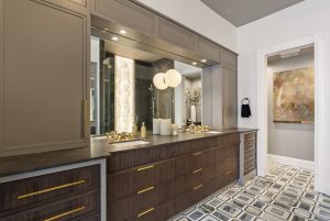 Bathrooms work hard. Steam, splashes, and daily traffic challenge every surface, so design choices have to keep their good looks even after long, humid mornings. A moisture-smart bathroom design doesn’t require a remodel dictionary—just a few practical decisions that protect edges, seams, and air flow.
Durable Bathroom Design: Where Moisture Actually Goes
Start with the path water takes. Splashes hit vanity fronts and toe-kicks, steam condenses on mirrors and ceilings, and drips run off elbows onto floors near the sink and tub. A durable bathroom design anticipates those paths with sturdy edges, wipeable finishes, and ventilation that clears the air quickly.
Surfaces That Survive Daily Use
Choose materials that shrug off water and clean easily. Quartz or dense porcelain tops handle puddles; solid-surface or tile shower surrounds avoid swollen seams. On floors, quality porcelain tile resists standing water and muddy footprints. Seal grout lines where recommended, but don’t rely on sealer to fix poor details—tight joints and good slopes matter more.
Edges, Seams, and Splash Zones
Protect the places water lingers. Add a shallow backsplash behind the faucet, run silicone neatly where planes meet, and wrap vanity edges with durable finishes that won’t blister. In showers, keep the niche out of the direct spray if possible, and slope the shelf slightly so it drains. Little angles prevent big headaches.
Ventilation That Actually Clears Steam
A quiet, correctly sized exhaust fan is the bathroom’s best friend. Use a timer or humidity sensor so it runs long enough to dry the room after showers. If the mirror stays foggy 15 minutes later, the fan is undersized or the duct path is too long. Crack the door during cool-down to keep air moving.
Bathroom Design – Lighting for Clarity and Comfort
Layer bathroom light like any other room. Side-mounted sconces at face level reduce shadows for grooming; a soft overhead or backlit mirror keeps the room from feeling stark. Warm-neutral tones flatter skin and tile alike. Dimmers let the space shift from energizing mornings to low-light, late-night trips.
Storage That Prevents Clutter in Your Bathroom Design
Moisture-safe storage keeps counters usable. Deep drawers with organizers corral daily items, and a slim cabinet can hold cleaning supplies off the floor. Keep towels near the shower so drips don’t trail across the room.
If you’d like a quick durability check on your current bathroom, request service and we’ll suggest changes that make it tougher without changing your style.